
Organizers for the 2028 Summer Olympics just dropped the official “Look of the Games” this week, and it’s a technicolor explosion of flowers, street-art vibes and pure SoCal energy designed to transform the city into a living, breathing spectacle.
Dubbed “LA in full bloom,” the design is inspired by California’s rare “superbloom” phenomenon — when the hillsides erupt with vibrant wildflowers after just the right amount of heavy rains.

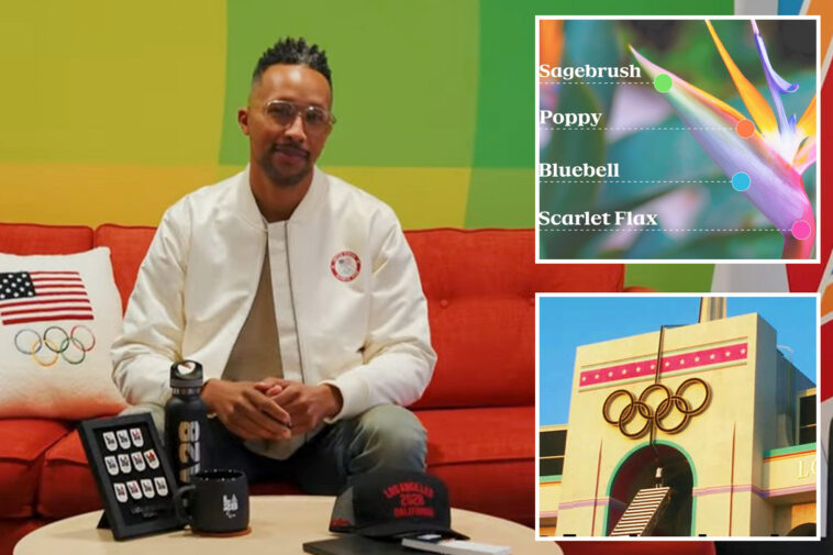
At the heart of the design is a collection of 13 “blooms” — graphic patterns representing the diverse cultures and neighborhoods of the city. The primary colors — poppy, scarlet flax, bluebell and sagebrush — were plucked straight from the bird of paradise, LA’s official flower, which organizers noted can be found everywhere from manicured residential lawns to gritty Venice Beach medians and Downtown.
“The Superbloom mirrors the spirit of the Olympic and Paralympic Games,” said Ric Edwards, LA28 Vice President of Brand Design and Executive Design Director.
“Athletes train their entire lives for a moment on the greatest stage in sports,” he said. “When the conditions are right, everything comes together and something extraordinary happens. That feeling of anticipation, energy and the culmination of the many moments that led them here is what inspired our ‘Look of the Games.’”

The branding includes a dynamic emblem featuring an ever-changing letter “A.” While the “L” and the “28” stay put, the “A” will constantly shift styles. The animated logo is built for the digital age.
The “Superbloom” won’t just be on your TV screen. Organizers say the graphics were engineered to scale — meaning you’ll see these patterns on everything from 100-foot stadium wraps visible from news choppers to the tiny credentials hanging around the necks of athletes.
“For type, we look to the city again,” Edwards said. “Strip mall and hand painted signage rule the streets of LA. We created four unique type faces meant to be stacked and combined into energetic and exciting layouts as expressive as they are quintessentially LA.”

Organizers say the graphics were built to pop from every angle, whether you’re in the cheap seats, watching on TV or catching aerial shots of the city.
The new look is a deliberate nod to the last time the Games hit the West Coast. Those with a keen eye for detail will notice color similarities to the neon confetti aesthetic of the ‘84 Games.
Sign up for the California Morning Report newsletter
California’s top news, sports and entertainment delivered to your inbox every day.
Thanks for signing up!
“We were inspired by the spirit of LA Games past,” Geoff Engelhardt, LA28 Head of Brand Design, said in a press release. “Both the 1932 and 1984 Games were bold, optimistic, Californian and unapologetically joyful. We wanted to carry that same emotional frequency forward, expressed in a visual language that feels distinctly of today.”