There’s something beautiful about baseball uniforms.
They are time machines stitched in fabric. They whisper history. They contain the greatness that wore them previously. They remind you that this game, at its best, is still played by grown men chasing something they first fell in love with as kids.
And then Nike came along and said, “Yeah … but what if we made it louder?”

Enter: City Connect uniforms.
A bold, sometimes beautiful, sometimes baffling experiment where tradition takes a back seat to culture, identity and occasionally … chaos. These aren’t meant to replace the pinstripes or the Dodger whites. They’re meant to feel like the city itself — its heartbeat, its art, its grit, its late-night neon glow.
Some teams understood the assignment.
Others showed up like they forgot it was due.
So, as the 2026 MLB season gets underway, here is the definitive, unapologetic ranking of all 30 MLB teams’ City Connect (or lack thereof) uniforms — where culture meets creativity and sometimes crashes into it.
30. Athletics (Sacramento Alternate) — Not Even Invited
Let’s call this what it is. The A’s don’t have a City Connect jersey because they don’t have a city. That’s not a joke — it’s the reality of a franchise in limbo. Sacramento gold or not, this is a placeholder for a team waiting for Las Vegas to feel like home. You can’t connect to a city when you’re emotionally checked out of one and not yet rooted in another.

29. Yankees — Tradition Over Everything
Of course, they don’t have one. Of course, they said no. The Yankees treat alternate uniforms like a violation of sacred text. Respect the history, sure. But also … loosen up a little!

28. Phillies — ‘Unapologetically Philly’ … Unfortunately
Blue and yellow. City flag inspiration. Blue-collar symbolism. I get the intent. I just don’t get the execution. These look like something you’d find on a clearance rack next to a knockoff Eagles hoodie. Philly deserves grit, not whatever this is.

27. Giants — A Swing and a Miss
They took a franchise dripping with visual identity — orange, black, timeless — and turned it into … this. The first iteration had a weird charm. This one feels like a design committee got lost halfway through the process. We get it, it looks like graffiti.

26. Rockies — Sweet Tarts Baseball Club
Baseball uniforms shouldn’t make you crave candy. The Rockies leaned too far into color theory and forgot about cohesion. Their first version had a pulse. This one feels like a sugar rush without direction.

25. Guardians — Bridge to Somewhere
An homage to the Hope Memorial Bridge sounds poetic. It should look poetic. Instead, it feels flat. There’s history here, but it doesn’t translate visually in a way that grabs you. At least it’s not all black.

24. Red Sox — Green Monster, Meet Identity Crisis
Yes, Fenway. Yes, the Monster. We understand the reference. But when your uniform looks like a highlighter exploded, subtlety might have been the better play.

23. Nationals — Cherry Blossom Regression
The original cherry blossom jerseys were delicate, thoughtful, alive. They were our favorite original City Connect uniform. This new version? It feels like a remix nobody asked for. Sometimes the best move is knowing when not to touch greatness.

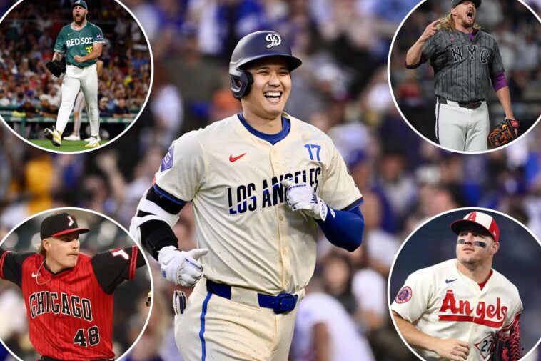
22. Dodgers — The ‘Funfetti’ Debate
The Dodgers are No. 22 on this list in honor of the great Clayton Kershaw. But also, it’s probably time to retire these jerseys as well. Los Angeles is a global hub of art, fashion, culture — a city that practically breathes creativity. And this is what we got? Speckled whites that look like a birthday cake exploded. It’s different, sure. But different isn’t always better. This should’ve been iconic. Instead, it’s polarizing.

21. Cubs — Waiting on Something Better
“Wrigleyville” was safe. Too safe. There’s buzz that a new design is coming, and it’s needed. This franchise deserves something that captures the ivy, the day games, the generational loyalty. Not just a neighborhood name slapped across the chest.

20. Cardinals — You Can’t Improve Perfection
The Cardinals have one of the most beautiful uniforms in sports history. So when they go all red with a basic “STL” cap, it feels like watching a masterpiece get repainted in a single color. It’s not terrible. It’s just unnecessary.

19. Tigers — Motor City, But Why Spell It Out?
The Old English “D” is sacred. One of the cleanest logos in sports. Writing out “Motor City” isn’t bad — it just feels like replacing poetry with a paragraph.

18. Diamondbacks — Serpientes in Purple
There’s something here. The identity, the language, the nod to heritage. But the execution doesn’t fully land. It feels like a concept that needed one more draft. The new night version is a cool color rush, though.

17. Astros — Space City, Slight Upgrade
The space theme works. It always will in Houston. This version is better than the first but still feels like it’s orbiting something greater instead of becoming it.

16. Twins — Lake Life Overload
The ripple concept is clever. The execution? A little too drenched in blue. It works, but it doesn’t wow.

15. Mets — Subway Series Aesthetic
All gray. Industrial. “NYC” across the chest. It’s gritty in a way that fits Queens. The 7 train detail is brilliant. It’s not universally loved, but at least it has a voice.

14. Rangers — Lone Star Storytelling
The “TX” branding. The peagle patch. The deep cuts into Texas baseball history. This one is layered, thoughtful and quietly strong. Not flashy, but it doesn’t need to be.

13. Reds — Blackout Done Right
You can’t go wrong with black and red. It’s clean. It’s modern. It plays it safe, but sometimes safe looks good.

12. Royals — A Step Back?
The “City of Fountains” jerseys had charm. Early leaks of the new design feel … less inspired. We’ll reserve full judgment, but the bar was already set.

11. Blue Jays — Night Mode Activated
Dark. Sleek. The skyline detail walks a fine line between cool and touristy. Still, this feels like Toronto after midnight — and that’s the point.

10. Padres — From Fiesta to Familiar
The original was electric. Baja colors, cultural depth, life. The new black version? Solid, but it traded personality for trend. The Día de los Muertos patch is a saving grace.

9. White Sox — South Side Meets ’90s Bulls
This is swagger. This is nostalgia. This is Michael Jordan walking through a baseball diamond. The White Sox may struggle on the field, but they won the uniform game here.

8. Angels — Surf’s Up Simplicity
It’s clean. It’s coastal. It doesn’t try too hard. The surfboard-inspired lettering is subtle, and sometimes subtle wins.

7. Brewers — Brew Crew Blues
Baby blue done right. It feels like summer. It feels like beer gardens and day games. It’s not revolutionary, but it’s undeniably likable.

6. Rays — Skate Culture Energy
This is where City Connect shines. Risky. Different. Alive. The neon pops, the skateboarding nod is authentic, and the cap is one of the best in the entire series.

5. Marlins — Vice City Perfection
Black and pink neon that feels like South Beach at 2 a.m. These aren’t uniforms. They’re a vibe. They understood Miami completely, and that’s the point, right?

4. Orioles — Back to the Core
If the leaks hold true, this is a massive upgrade. Clean black, “Baltimore” across the chest, rooted identity. Sometimes the boldest move is simplifying.

3. Pirates — Finally, They Got It Right
If the leaked design is real, this is a home run. Dark, pirate-inspired, authentic. A massive leap from the forgettable yellow “PGH” jerseys. This feels like Pittsburgh.

2. Braves — Hank Aaron Lives Here
This is how you honor history. A nod to 1974. To greatness. To Hank Aaron rewriting the record books. It’s emotional. It’s powerful. It’s almost perfect.

1. Mariners — Steelheads Legacy
This is it. This is what City Connect uniform is supposed to be. A tribute to the Negro Leagues. To the Seattle Steelheads. To a part of baseball history that deserves to be remembered, celebrated and worn proudly. It’s clean. It’s meaningful. It tells a story bigger than the game itself. And in the end, that’s what the best uniforms do. They don’t just represent a team. They represent something deeper. Something lasting. Something worth remembering. Seattle is replacing their old city connect with these for every Sunday home game to honor their 50th season in MLB.